Vikontse — logo design
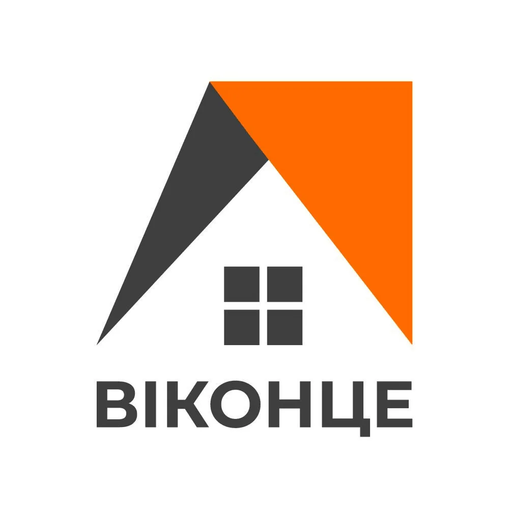
A recognizable mark that combines the shape of a house roof and a window in one concise symbol.
Challenge
Our client Vika approached us asking to develop a logo for the Vikontse company. She needed a mark that immediately evokes the field of work (windows/construction), is easy to use on various media (from a signboard to a business card) and remains easily recognizable even at small sizes.
Solution
The mark is based on the shape of a house roof split into two parts — dark grey and the brand orange — reading simultaneously as a roof and as an arrow/pointer. Under the roof there is a window silhouette with a frame that directly reflects the company's field of work. The name is set in a bold geometric typeface for maximum readability on signboards and in small sizes (favicon, social media).
Final mockup
The main logo version — a concise mark and brand typography.
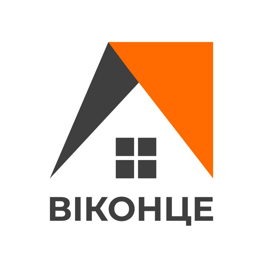
Main logo version
Mark + wordmark
Results & Impact
A concise, easily recognizable mark that conveys the field of work without additional explanation
The logo scales well — readable both at large (signboard) and small (icon, favicon) sizes
A clear color pair (dark grey + orange), convenient for further use in branding
Client review 💬
“The logo turned out exactly as I imagined — simple, stylish, and it's immediately clear what we do. Very pleased!”
Vika, Vikontse
Project team
Snizhana — designer
Ready to start?
Tell us about your project — we'll suggest the best solution and deliver it fast and with quality.
Write on Telegram